Apnova
Industry
Engineering, Hospitality
Share On
Services Provided
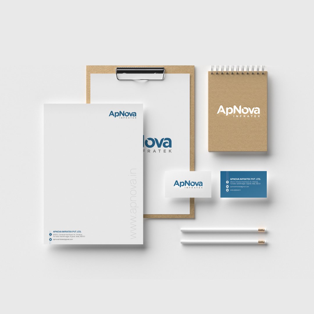
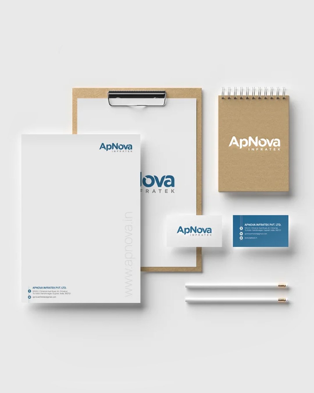
Zero Designs partnered with ApNova Infratek, a pioneer in modern hygiene recycle bins, to build a strong and impactful brand presence.
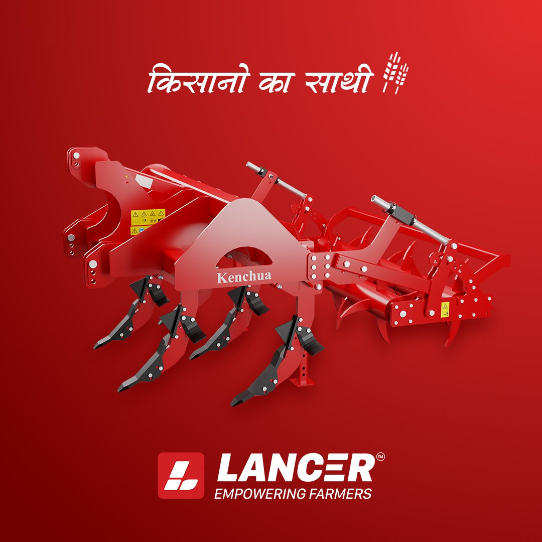
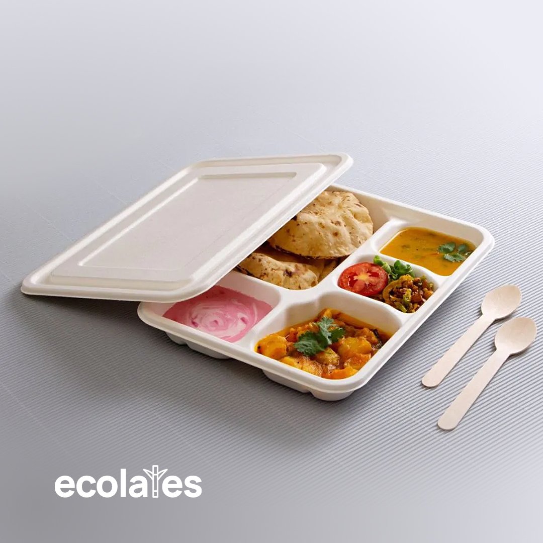
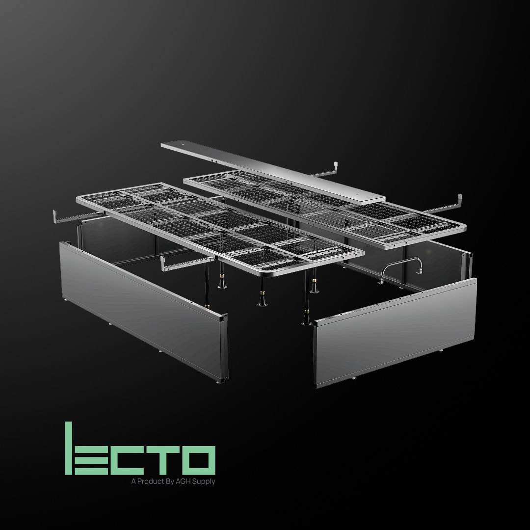
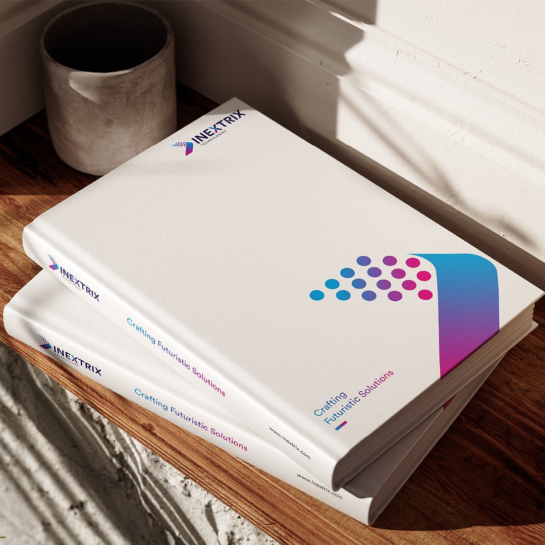
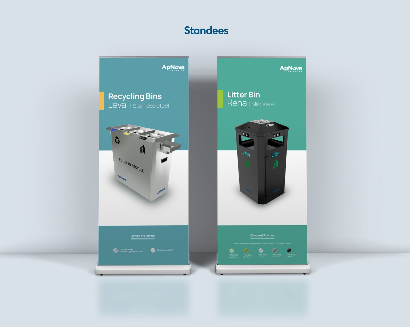
We crafted a distinctive logo and brand visual identity, designed a user-friendly website, and developed 3D product visualizations to showcase their innovations. Additionally, we created an informative brochure and marketing collaterals to support their outreach and growth.
- Frameworks WordPress




Conclusion
We strengthened ApNova Infratek’s corporate branding identity with a distinctive logo and visual identity. A user-friendly website and 3D product visualizations showcased their innovations effectively. Engaging brochures and marketing collaterals supported their outreach and growth. This transformation reinforces ApNova Infratek’s impact in modern hygiene soluti


![Headshot of the client associated with the [Lancer agrico] project by Zero Designs](https://www.zerodesigns.in/assets/uploads/2025/03/06-Swapnil-Patel.webp)


